Unit 59: Web Authoring Production Evaluation
- Oct 16, 2015
- 5 min read
The brief for this assignment required us to create a personal portfolio website to showcase our work that we have created over our time on the media class. As well as being there for college work the website is a chance for us to advertise what we have made to potential employers and universities. The brief included the requirement to show your personality into the site, I feel I have accomplished this as my passion is for comic books and in particular superheroes. To show this off I decided to make the main colours of my site the three primary colours. These colours feature on some of the most iconic comic heroes like Superman, Spider-Man and Iron Man; it is because of this I felt it would make my site more eye-catching. Other comic related iconography I put on the site are onomatopoeia and text/caption boxes, the former to make the site feel comic related and the latter to separate text and seem like a panel layout. I have included all sections listed on the brief as different pages; however some are more filled out than others.
We have had a total of three assignments that ended with the website creation all helping us plan out how we were going to create the site. Our first one had us learn how to use HTML coding software, although outdated and unnecessary today in the way that websites can be built with tools such as WIX it was still needed to prove I know the basics of websites. For the second assignment we had to plan out our site and our intentions by making mind maps, site designs, research, contingency plan and more. All of this allowed us to get a better idea of how our sites could appear and work as well as laying out the intentions we had. My website functions the way I had intended with a menu bar that links to the correct pages and images that once clicked display in their full version. The site’s aesthetic is how I intended it to be, however it does appear different to how I imagined it on the planning images. This is because of the limited colour spectrum and shapes I was working with, once I began to design my site instead on ovals, triangles, circles and other shapes I surrounded my backgrounds in onomatopoeia.
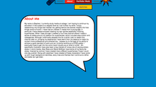
I included several videos on my site which were college projects as well as two short documentaries on me form other students. The former collection of videos showcases the projects I have taken part in whilst the latter can give users a better insight into who I am so I included it in my “About Me” section. Other pages showcase my college assignments, sketches, contact, work experience and my blog. I included relevant information on each page and I will update these pages as I expand my work in the future. On all of the pages I chose to use a panel like layout, to achieve this I made thick black boarders around white boxes, after I put content inside these boxes. I arranged them horizontally and vertically depending on the page adding to the comic effect. On the about page I used a rectangular speech balloon instead, the reason for this is I felt it would appear better especially with a comic theme that someone was telling the user information. On some pages I used yellow text boxes to headline pages the reason for this was to give the look of comic transitional sequences like “Meanwhile…” or “Later on…”.
I used a gallery display for my sketches page, the reason for this is because it is what is commonly used to display art on other websites I researched for the previous assignment. On the assignments page I linked a couple of Word documents for examples of my work, I did this as it saves creating more pages on the site for single items and takes the user directly to my work. On my homepage I have three links to other pages, the links display examples of the content on that page. I did this to entice the user to explore further. I made what I feel is most important to my site the biggest thing on the homepage, which is my portfolio. I chose to link to the “Sketches” sub-page as that is the work I based my site around.
I have a navigation bar at the top centre of each page, the links all hyperlink to the correct pages including on the mobile version of the site. Hyperlinks are also included on the majority of other pages and correctly work as well, whether they link to an expanded version of something on the site or a link to another website or document. The mobile version of the site jumbled my site to various degrees, overlapping and rearranging items. I had to change this and make the mobile site navigational, after I readjusted the content I took many images away or “hid” them apart from two, one for the top of the page and one for the bottom. This made the site far more appealing on mobile without much in the way. It also allowed both versions to be slightly more unique to one another in their display.
I created the site in around 10 days, I began on the 6th of October and finished on the 16th. I started with the basics of colour, a navigation bar, layout and a logo. From there I expanded the detail of the background in later days, adding boxes, information and links. I added final touches on the last few days to make sure everything was working such as both versions of the site. I also kept a blog of my progress through the days which is split into days. I feel I could have managed to get things done quicker if I was more organised giving me more time to finalise the website.
From this project I learnt how to create a website and how to make it reflect myself. I learnt how about HTML and how it operates as well as personal portfolios and how they can best advertise your skills to the relevant people. I feel if I spend more time on the site I can create things in more detail, most of all I would like to rework a lot of the background as the onomatopoeia images seems blurred and too similar in some instances.
I could possibly create new pictures or alter the colours of some of ones already there from green to red for instance. I also feel I could have laid out my time frame better as I did not stick to my initial plan. I might try altering the layout of some pages to get different comic book effects like splash pages or a mixture of panel layouts. Another thing that I could improve are the links on the mobile version of the college assignments page. Since there is a limited view on mobile the longer titles go off the page, I can try and find a way to condense these longer titles or maybe alter them.
From the feedback I got from my peers they feel like my site is unique and very much expresses who I am. Some of them said that if they did not know who I was already they would instantly say they knew my passion was for comic books. They also liked the bright colours I used feeling it was attention grabbing, in contrast to a lot of blank or darker looks many website go for.


Comments