Production Diary Day 3 Part 2
- Oct 13, 2015
- 1 min read


My contact page does not have much on it but I feel these are the best ways for people to get in touch with me. My e-mail address and my media YouTube channel have ways people can message me. Again I went for the panel style on this page.
This is the logo I created for the site I choose this design as it incorpoates my love for comics by using the panel look. As well as hinting towards my favorite comic book character by using words and colours assosiated with his iconography, whilst not stating it directly.

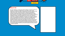
Finally I had to make sure my website was compatible with moblie devices. Unfortunatly because of the amount of images I included, every page ended up jumbled with pictures and information. An example is shown in the image on the left.

To rectify this problem I edited the mobile view of the site. I deleted/"hid" all but two of the images that were taking up the screen, one for the top of the page and the other for the bottom. On some page I kept more images in order to break up content like videos. I rearranged the content that was in the wrong order or on top of one another.
I also changed the font and box sizes of certain things if they did not fit on the screen or blend well with the sites look. The site keeps its tone on moblie but on a computer extra content brings my full idea to screen.


Comments