Production Diary Day 2
- Oct 8, 2015
- 1 min read


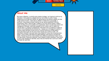
For the second day of website creation I wanted to focus on the background details at first. I created several onomatopoeia type words to make my site 'pop'. I used many colours in order to keep with my bright theme. Alot of them are at tilted angles, I did this as comic books use them in this way to show frantic action.
I created all of the other pages that were required in my assignment such as "college work" and "contact" pages I plan on filling these later. Like all other pages I placed the onomatopoeia images on them but in a different order for variety.

I made a "comic sketches" page to show off the artwork I am doing for college targets and my personal time. I chose a gallery window style to show the images that reveal the names once scrolled over, and can be expanded to show a larger image. I will continue to add more to this page in the future.

My work experience will showcase skills I have learned
and where I have got experience. So far I have only worked in one place but I plan on expanding this page later. This page and others on my site have a yellow text box as their titles, I did this to evoke comic transition captions such as "later..." or "meanwhile...".


Comments